Using Git Versioning Data to Analyze Development Lifecycles
Recently, we heard from a customer that it is difficult to track and understand the progress being made on a software project, and it is especially difficult when they aren't a part of the active agile scrum meetings. Well, that got us thinking that there could be a way to use the versioning data (from git, a DoD DevSecOps approved tool) of a code repository to understand a little bit more about the progression of the project and from there, developing a product that serves to infer the lifecycle of a similar project in the future (and we have some ideas for that too, so stay tuned!). For our analysis, we're using the commit data from the DoD Platform One Big Bang repository on GitHub.
Getting Started
There are a few python libraries that we used for this short project. This project was also inspired by this write up on notebook community[^1]. For reference, we are using M1/M2 Macs at HQ, so we set up our development environment from miniforge[^2]. Similarly to the previous project regarding document keyword frequencies, we started with creating a conda environment:
conda create env --name YOUR_NAME -y
Once you have your new conda environment activate it using:
conda activate YOUR_NAME
For those using Windows, creating a new virtual environment[^3] should act to serve the same purpose. To specify the python version used, you can use the command option --python.
With the environment active, it's time to start installing the requirements that we'll be using for this project with pip. This single line should install all of the desired packages.
pip install python-dateutil pandas git random plotly matplotlib numpy mplcursors
The packages, dateutil[^4], pandas[^5], GitPython[^6], plotly[^7], matplotlib[^8], numpy[^9], mplcursors[^10] have far greater capability than we explore here - we strongly recommend exploring the references. Lastly, pull down the repository that you're looking to analyze and clone it locally using:
git clone <COPIED SSH ADDRESS OF REPO>
Pulling in the Repo Data to be Analyzed
Using the packages you installed, we'll read in the repo commit data using the following few lines of code:
GIT_REPO_PATH = r'../repositories/big-bang'
repo = git.Repo(GIT_REPO_PATH, odbt=git.GitCmdObjectDB)
repo
commits = pd.DataFrame(repo.iter_commits('master'), columns=['raw'])
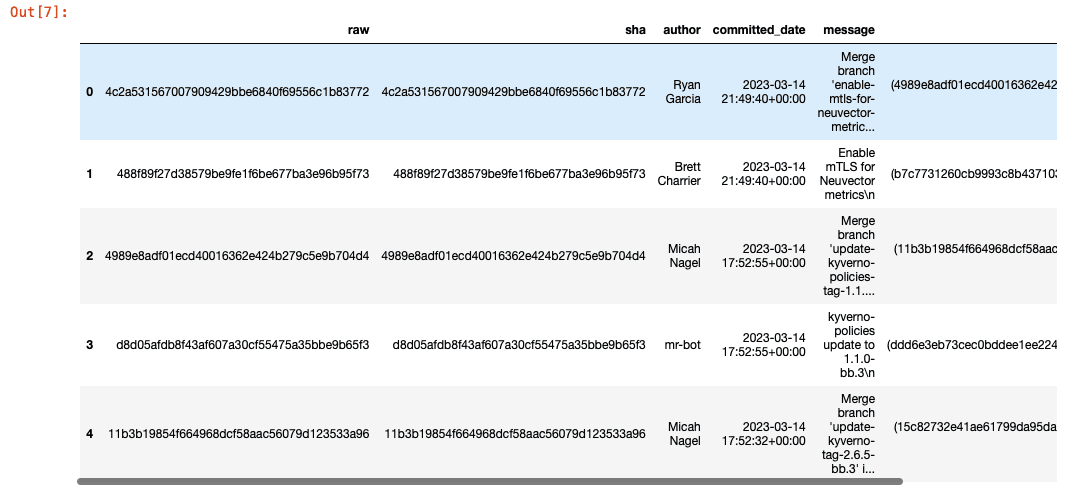
commits.head()
This will display the top 5 commits in the DataFrame. Next, we'll want to pull the last commit to the repository to identify the different data points that each commit holds to further build out our dataframe using lambda functions.
last_commit = commits.iloc[0]

last_commit['raw'].__slots__

commits['sha'] = commits['raw'].apply(lambda x: str(x))
commits['author'] = commits['raw'].apply(lambda x: x.author.name)
commits['committed_date'] = commits['raw'].apply(lambda x: pd.to_datetime(x.committed_datetime, utc=True))
commits['message'] = commits['raw'].apply(lambda x: x.message)
commits['parents'] = commits['raw'].apply(lambda x: x.parents)
commits['committer'] = commits['raw'].apply(lambda x: x.committer)

commits.head()
Visualizing the Commit Data
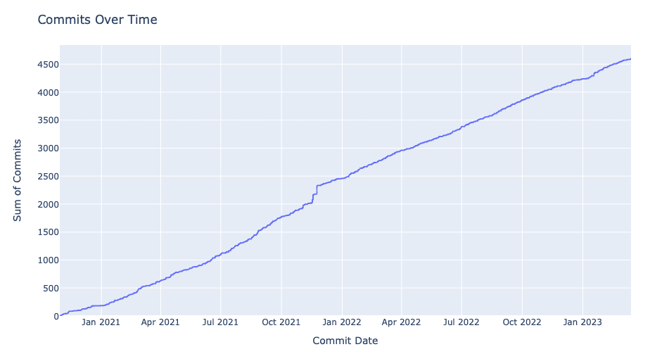
Now the DataFrame should have the columns for sha id, author, commit date, commit message, parent commits, and committer. The first visualization we'll want to see is the commits per day compounded over the development period. We can do so by creating a new DataFrame with commits grouped by commited date and then using an empiral cumulative distribution function (ECDF) plot:
commits_by_date = commits.groupby('committed_date').size().reset_index(name='commit_count')

commits_by_date

fig = px.ecdf(commits_by_date, x='committed_date', y='commit_count', ecdfnorm=None)
fig.show(renderer='notebook')
Gaining a Deeper Understanding of the Commit Data
Now, managing the delivery of software projects boils down to more than just commits, as we can understand in more depth the magnitude of changes by incorporating the data associated with additions and deletions as parts of commits. This will help us understand if the team is making bigger changes to the code at different points in the development process or different parts of the year. Now this is a little more challenging, so I'll share the code block to join the lines changed data to the commits DataFrame and then explain how it works afterwards.
rand_commit = commits.iloc[random.randint(0, commits.shape[0])]['raw']

rand_commit.stats.files

rand_commit_df = pd.DataFrame(pd.Series(rand_commit.stats.files)).stack()

stats = pd.DataFrame(commits['raw'].apply(lambda x: pd.Series(x.stats.files, dtype=object)).stack()).reset_index(level=1)
stats = stats.rename(columns={ 'level_1' : 'filename', 0 : 'stats_modifications'})
stats_modifications = stats['stats_modifications'].apply(lambda x: pd.Series(x))
stats = stats.join(stats_modifications)
del(stats['stats_modifications'])

commits = commits.join(stats)
del(commits['raw'])

commits.head()
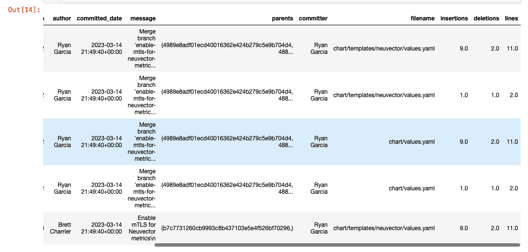
From the comments in the code above, you can see we're pulling the stats on files changed for a random commit as a Pandas Series, and then applying the same effects to the remainder of the data in the commits DataFrame through the join function from Pandas.
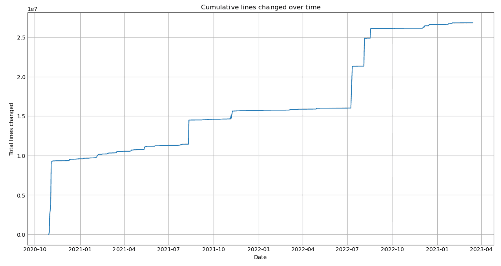
With a full DataFrame, we want to now visualize the lines changed over time and per day. To make those visualizations, we'll use the following code:
Cumulative Lines Changed Over Time:
plt.figure(figsize=(12, 6))
plt.style.use('_mpl-gallery')

commits_by_date = commits.groupby(commits['committed_date'].dt.date).sum(numeric_only=True)

plt.plot(commits_by_date.index, commits_by_date['lines'].cumsum())
plt.xlabel('Date')
plt.ylabel('Total lines changed')
plt.title('Cumulative lines changed over time')

cursor = mplcursors.cursor(ax)
cursor.connect('add', lambda sel: sel.annotation.set_text(
    f"{sel.index}\n{sel.artist.get_xdata()[sel.target.index]:%Y-%m-%d}\n{sel.target[sel.index]:.0f} lines changed"))

plt.show()
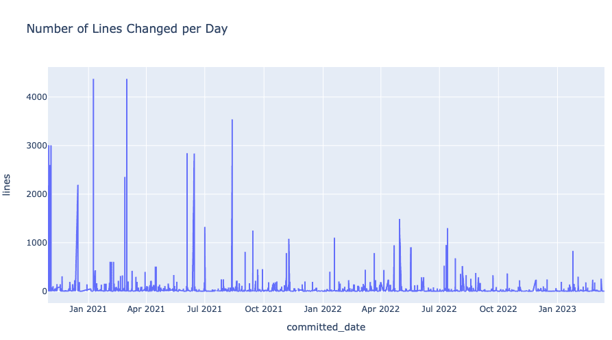
Number of Lines Changed per Day:
fig = px.line(commits, x='committed_date', y='lines', title='Number of Lines Changed per Day')
fig.show(renderer='notebook')
Future Iterations
To continue improving on this idea, we plan to incorporate machine learning topic areas such as natural language processing (NLP) for identifying other similar projects (based on the code, project descriptions, etc) as well as linear regression (to identify what the timeline would look like for similar projects and their anticipated scale). As we work on these areas of expansion, we'll continue to update here on our labs site.
Usage
If you want to try this out for yourself, clone the source code repository on our GitHub and open the jupyter notebook in your conda environment in terminal using jupyter notebook project-analysis.ipynb. Any questions? Feel free to contact us and ask away.